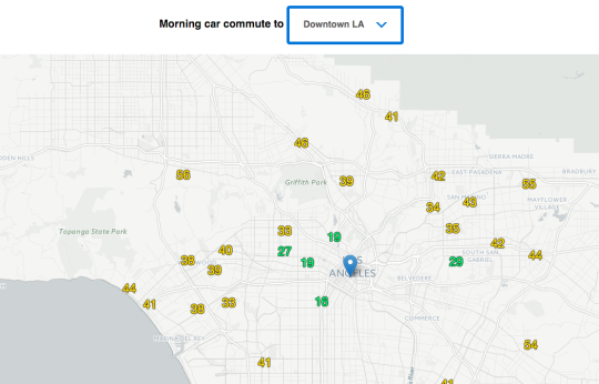
This month, I chose to visualize LA commutes. The data is visualized & published here: http://xta.github.io/la_commute/
For the starting locations, I chose a mix based on highly populated areas and places of interest to me. I wanted to get a good distribution throughout the greater LA area. I realize that most people wouldn’t commute nearly two hours a day, but the sad reality is that people do have these long or even longer commutes.
For the destinations, I chose three popular, work-concentrated areas (Santa Monica, Century City, and Downtown Los Angeles). I realize that many people do not work in these 3 locations, but these locations help visualize a horizontal slice across central LA.
My workflow was running a local Ruby script multiple times a day throughout the past few weeks. I have both morning & evening commute data, but I think morning commutes are more interesting. I may be wrong, but I’m assuming that morning commutes are more consistent (people leave for work around 7 to 8am, and they leave work anywhere from 3 to 9pm).
Once I had the data, I loaded my csv file(s) into Google Sheets. With Google Sheets, I did basic sorting and aggregating of the commute times. I output my data in a specific format so that I could easily consume it with my JS code.
Loading the data into Leaflet.js markers wasn’t too bad. The hardest part was styling & displaying the commute data properly. Originally, I wanted to draw labelled lines between the different locations to the destination, but labelling lines appears to be really difficult with web map libraries. I also didn’t want to hide all the data behind a tooltip that had to be clicked.
Overall, I’m pleased with my basic workflow and the power of Leaflet.js. Collecting traffic data was the most difficult part.
Mapping library used is Leaflet.js. Map & map data are from OpenStreetMap contributors. Map tiles are from CartoDB.