What do websites prioritize? User sign in (mainstream) or user sign up (startups)?
Top US sites (per Alexa)
I looked at the Alexa Top US sites list and went through the top 10. These are established websites. The purpose of the site helps determine which options (Sign in & Sign up) to feature. Is it a gateway to content (Google, Yahoo)? A source of content (Wikipedia, Youtube)? A social network (Facebook, Twitter)?
The call to action of each site is interesting (and surely optimized in countless ways). Let’s look at the top 10 US sites:
- Google
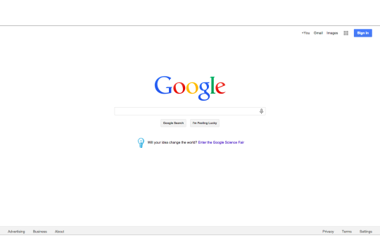
Google only provides an option to Sign In. They’ve kept their homepage uncluttered with a clear call to action (to search). - Facebook
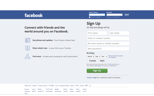
Facebook wants sign ups, and they offer both Log In & a giant Sign Up form. As a social network, if you don’t log in or sign up, you can’t really do anything on Facebook. Interestingly, the Log In form has the focus so you can immediately type in your login credentials. This one goes to Sign Up, just look at that real estate. - Youtube
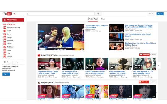
Youtube has two different Sign in buttons. As Google owns Youtube, this is consistent with their assumption that you already have an account and are not new to Youtube. Also like their parent, Google, Youtube allows you to use their site right away without signing in. - Amazon
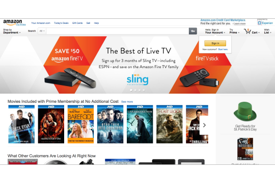
Amazon only provides a Sign in button. As a store, you can immediately click on things to view and perhaps purchase. Amazon, like most stores, lets you add things to your cart without an account. When you want to checkout, you can sign in or create an account. - Yahoo
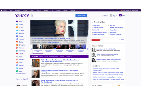
Yahoo only provides a Sign In link. Yahoo, an enduring web portal, lets you do many things on from their homepage. You do not need to be logged in to use their site (for things like news, weather, etc.). - Wikipedia
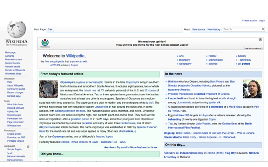
The English Wikipedia page has a tie between “Create account” and “Log in”. Perhaps “Create account” wins since English is a left-to-right language. For our purpose, we’ll consider Wikipedia a tie for user accounts. Wikipedia is a content source and you can (and most likely) browse it without signing in. - Twitter
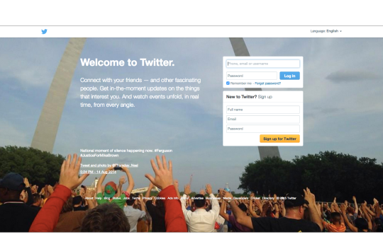
Twitter is similar to Facebook. It’s a social network, but Twitter doesn’t have as strict of a login requirement as Facebook to use it. Like Facebook, Twitter’s default focus falls on the Log in form, but the Sign up form takes up more real estate. We’ll give this round to Sign up. - Ebay
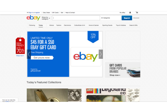
Ebay is an auction site or a shop. As such, you can browse most of the site without logging in. The header contains “Sign in or register”. Since they provide both options without giving one option a more prominent style, this is a tie. - Linkedin
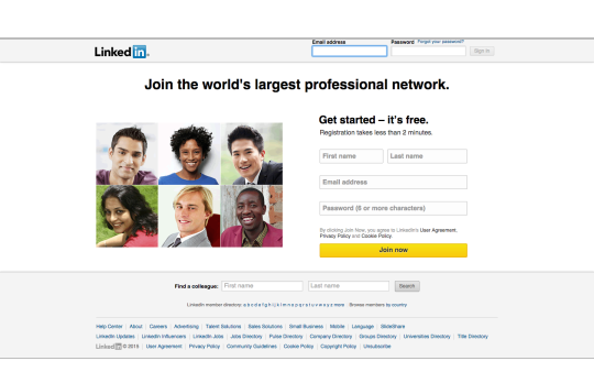
LinkedIn is a professional social network. Along with Facebook & Twitter, it places a heavy emphasis on sign up. There is a large form and giant “Join now” button in bright yellow. LinkedIn also defaults the focus to the Sign In form. Since social networks display different content for each user, having an account is important to experience the social network as intended. - Reddit
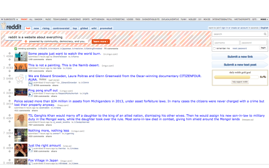
Reddit is an online community that tends to provide news and other user generated links. Reddit can be used without an account since you can read most of the content without logging in. Reddit provides small text links for “sign in” and “create an account”. There is a big login form nested or obscured between a search input and submit buttons.
Recent YC Startups
For the sake of picking some newer companies, I went to yclist and looked at the first five. I’m sure there are better ways to come up with new startup sites, but I wanted something reasonable and simple. For these startups, I’m going to focus on their Sign In vs Sign Up call to actions (not their business model).
- Abacus
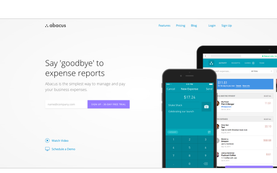
Abacus has Login & Sign Up links in the header, but the page is clearly focused on signing up for a free 30 day trial. There’s screenshots of their product, a Watch Video link, and a Schedule a Demo link. All signs that they want you to find out more and sign up. - AirHelp
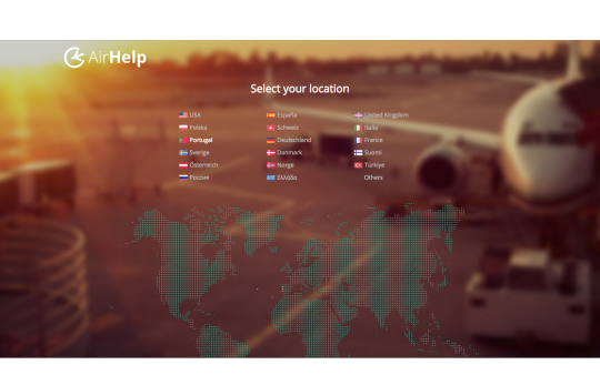
AirHelp has something which I haven’t seen in a long time: a choose your location screen. Selecting “US”, there’s are multiple Call to Actions for “Start your claim”, “Check if you’re eligible”, and “Don’t have a claim yet?” to entice you to start (or sign up). - AirPair
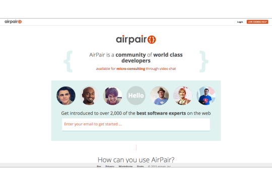
Airpair has a header link for “Login”, but a giant input for “Enter your email to get started …”. Clearly, they want to draw your attention to enter your email and get started. - Algolia
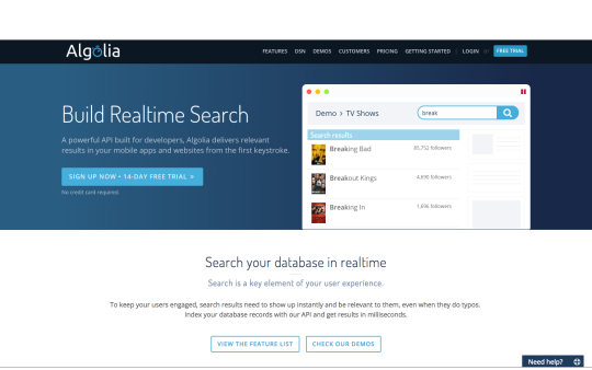
Algolia’s header contains a “LOGIN” and a “FREE TRIAL” link/button. The “FREE TRIAL” in the header is very prominent since it has so much contrast with the other header elements. In addition, the page is dedicated to “SIGN UP NOW”. - Ambition
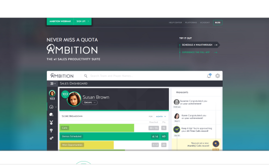
Ambition contains a “SIGN UP!” element in the header that is very prominent (high contrast and 2nd item from the left). The page itself is dedicated to “TRY IT OUT” with various ways you can sign up.
Summary
We looked at 10 big US sites and 5 startup sites. Within the top 10 US sites, there were 5 sign ins, 3 sign ups, and 2 ties. Within the arbitrarily selected startups, all 5 were sign ups. This makes sense since websites start out and assume that visitors don’t have an existing account. As sites become mainstream, they make the assumption that most people visiting already have an account. If the site doesn’t require user features (Google, Youtube, Wikipedia), you can start using the site right away. If the site practically requires user features (Facebook, Twitter, LinkedIn), they offer both Sign Up and Sign In options.
Choosing to feature Sign Up versus Sign In is interesting since it is a big step for a startup to de-prioritize new users (Sign Up). I don’t have the data, but I would be interested in when sites like Youtube, Yahoo, etc. switched from featuring “Sign up” to “Sign in”.
All of the top US sites we looked at mentioned “Sign in”. All of the startups we looked at prioritized “Sign Up”. Looking at what company’s deem important to draw your attention and place on the homepage is very revealing.