Is Google is ready to leave the familiar comfort of white backgrounds?
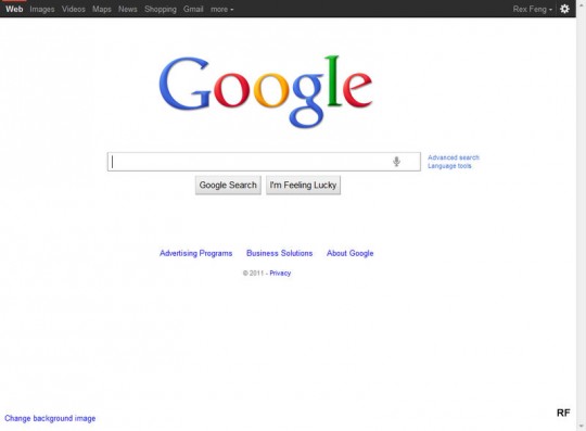
Google.com
This new Google homepage is part of their Google+ push. Notice the black bar at the top.
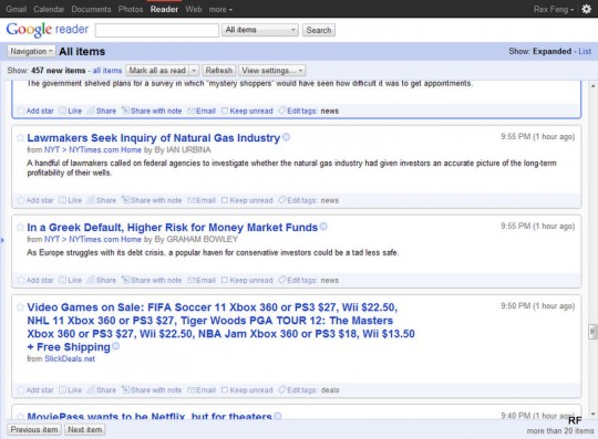
Google Reader
The black bar even invaded my Reader.

Updated Google Reader Mobile Appbar
An Appbar has even taken over their mobile web app.
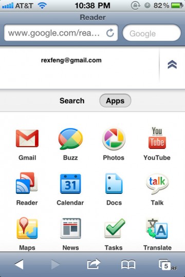
Apps Section of the Mobile Appbar
This Apps Section shows when you press “more” on the screen above. Oddly, Apps (and not Search) is the default choice.
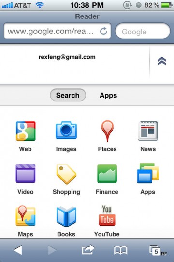
Search Section of the Mobile Appbar
This is what pressing “Search” reveals.
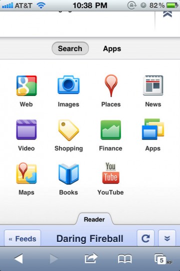
Bottom of expanded Search Appbar Section
This screen shows you what the bottom of the Appbar looks like. Just in case you forgot you were in the Reader mobile web app.
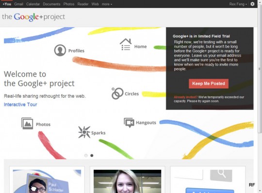
Google+ Invite Request Screen
Back to Google+.
This is what it looks like when you go to the site uninvited. You can request an invite by clicking on “Keep Me Posted”. Notice “+You” now appears at the top left of the black bar.
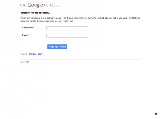
Google+ Invite Request Form
This form appears after clicking “Keep Me Posted”.
A strange gaffe here. I have to enter my name and e-mail? If you look at the prior screen, I’m logged into Google Accounts, but here they ask for my info again.
Google Maps (when it finally recognized your Google Account) was the best thing ever. No longer did you have to fill out both the “From” and “To” fields to e-mail map directions. As it currently does, the “From” is pre-populated with your Google Account e-mail address. Recognizing your Google Account after you click “Keep Me Posted” is what Google+ should do.