While working on adding localization to my tip calculator, one thing that seems obvious in retrospect is the difference between a device’s language & region. iOS lets you set the language & region separately. For example, you might want to read text in English, but you could be in Asia. This is relevant to tipping since you could travel to a country where tipping is expected, but the country your phone’s language is associated with doesn’t traditionally tip.
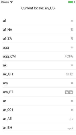
While exploring locales and currency symbols, I whipped together a basic demo app that lets you scroll between all the known locales and their currency symbol in iOS 10. This is pretty useful since you can quickly see what the currencySymbol is for each known iOS locale.
Below is the full implementation of very hacked together (quick and dirty) code. All you need to do:
- Create new Single View Application project in Xcode
- Replace the ViewController.swift with below (written for Swift 3)
- Run the app in Xcode
import UIKit

class ViewController: UIViewController, UITableViewDelegate {

    let cellIdentifier = "Cell"
    let currentLocaleHeight = CGFloat(80)

    let locales = Locale.availableIdentifiers.sorted { $0.localizedCaseInsensitiveCompare($1) == ComparisonResult.orderedAscending }

    override func viewDidLoad() {
        super.viewDidLoad()

        let tableView: UITableView = UITableView()
        tableView.frame = CGRect(x: 0, y: currentLocaleHeight, width: view.frame.width, height: view.frame.height)
        tableView.dataSource = self
        tableView.delegate = self

        self.view.addSubview(tableView)

        addCurrentLocaleLabel()
    }

    func addCurrentLocaleLabel() {
        let local = Locale.current.identifier

        let width = view.frame.width
        let label = UILabel(frame: CGRect(x: 0, y: 0, width: width, height: currentLocaleHeight))
        label.text = "Current locale: " + local
        label.textAlignment = .center
        view.addSubview(label)
    }

}

extension ViewController: UITableViewDataSource {

    func numberOfSections(in tableView: UITableView) -> Int {
        return 1
    }

    func tableView(_ tableView: UITableView, numberOfRowsInSection section: Int) -> Int {
        return locales.count
    }

    func tableView(_ tableView: UITableView, cellForRowAt indexPath: IndexPath) -> UITableViewCell {
        let cell = UITableViewCell(style: .value1, reuseIdentifier: cellIdentifier)

        let localeString = locales[indexPath.row]

        let numberFormatter = NumberFormatter()
        numberFormatter.locale = Locale(identifier: localeString)

        cell.textLabel?.text = localeString
        cell.detailTextLabel?.text = numberFormatter.currencySymbol

        return cell
    }

}
Note that the “¤” symbol means the currency is unspecified.

