Tag Archives: keyboard

Using the MIYA Pro Mac Keyboard

I recently picked up the Ducky MIYA Pro Mac White LED 65% Dye Sub PBT Mechanical Keyboard. This seems to be a rebranded Varmilo keyboard as the cables are branded with Varmilo.

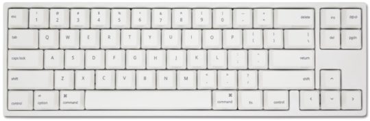
The form factor (tenkeyless) is nice and compact. The lack of numpad on the right gives me much more space for my mouse. As expected from a mechanical keyboard, the sound of the keys is noticeable.

I went with Cherry MX Brown switches. The keyboard typing feel is nice but requires more effort than a flat chiclet keyboard.

I went with this keyboard since I wanted different things: 1.) mac support, 2.) tenkeyless, and 3.) cherry mx browns.

The keyboard comes with an instruction manual in Chinese & English. I find the documentation to be lacking. You’d think a keyboard would be plug and play, but this keyboard is more complicated due to the top row sharing Number keys & Mac media/shortcut keys.

When I got my keyboard, it took me some time to figure out that Fn + A turns the keyboard into Mac mode. Fn + W would change it back to the default, Windows mode. I also had to activate “default mode” (it’s unclear to me what this means) by pressing Fn + D to be able to use the Number keys as numbers and have my Mac recognize the keyboard configuration.

Other things that confused me for a bit was the PgUp & PgDn alternating lights. Apparently one or the other never turns off? This is annoying for someone who values the little details and prefers certain aesthetics. I’ve read online that it lights up (one or the other) to indicate whether the keyboard’s top row is in Numbers mode or Media mode. To switch between the two, it’s Fn + PgUp for Numbers and Fn + PgDn for Media.

To use F1-F12, it’s Fn+PgDn, then Fn+F1 for F1 (and so on through F12).

As a software engineer, it took some time to figure out that Fn + Esc activates the backtick key (`).

Overall, the small form factor & hearty typing key feel are great. It’s unfortunate that a keyboard has a learning curve, but that’s the price to pay for a condensed layout where keys have double or triple duty.

My Aging MacBook Situation

My personal daily driver is a 2011 MacBook Air (MBA). I’ve shipped 6 iPhone apps from it. For a computer bought in 2011, I’m happy with how long it has lasted.

I am interested in buying a new MacBook Pro (MBP) to replace my aging MacBook Air, but I’m not sure what to do. The possible choices I see are:

1.) the current MBP (June 2017 version)
2.) wait ? months for an updated MBP (most likely a minor CPU refresh)
3.) a 2015 MBP version (older hardware style with IMHO better keyboard)

Reasons to upgrade sooner:
* Xcode runs poorly on my MBA. Storyboard, Simulator, and Playgrounds are barely usable.
* macOS Mojave will not run on my MacBook Air. It’s only a matter of time before I’m locked out of macOS & Xcode updates.
* Apple announced a Keyboard Service Program.
* As a professional software developer, I can easily justify 2-3 year upgrade cycles.
* My MBA is showing it’s age; the battery is virtually gone.

Reasons to upgrade later:
* My MBA is able to run Xcode 9 (current) and will hopefully run Xcode 10 GM.
* Buying after a new hardware refresh (minor CPU bump most likely) maximizes the currentness of the purchase. This may not be rational, but it’s a factor nonetheless.
* My iPhone app development is primarily dependent on iPhone hardware updates & Xcode, not my Mac.
* Indecision – since none of the current MBP options (2015 or 2017) are very appealing, I can wait it out.

Reasons that don’t make a difference:
* I don’t like typing on the current generation MBP keyboard, but the next significant MBP hardware refresh is probably a few years away (too long).
* USB-C – I’ve found a Multi-Port Adapter (dongle) that works for me.

Inconclusion

In retrospect, I should have bought a decently equipped 2015 MBP in 2015.

If Xcode 10 GM doesn’t work on my Mac, then I’ll be forced to buy a new Mac right away. Otherwise I will wait around hoping Apple decides to update the MBP.

Apple Keyboard Shortcuts

We get it. Apple is the company that pays attention to the details. No detail too small, they create their own reality. With a strong internal design culture, they provide customers what they want before they ask for it. But sometimes they misfire (such as their power cords).

I recently started using OS X Lion. Spotlight (command + space) is amazing. Hot corners are cool. The difference between switching applications (command + tab), switching windows (command + `), and switching tabs (control + tab) sucks.

Looking at OS X’s menu bar, how would you ever figure out that that a sloping line with a horizontal line indicates the option key?

Menu Bar example (top to bottom: command, shift, and option)

The command key is clearly labelled on the keyboard. Not sure how you would easily describe the command key symbol’s shape over the phone.

The shift (the up arrow circled above) and the delete key (not circled) can be deduced by your average power user, so I’ll give Apple a pass.

The option symbol, which I’m still not sure how to easily describe (the bottom circled symbol) is a mystery.

Here is what an Apple keyboard looks like:

Apple Keyboard (from left to right: shift, option, and command)

While Apple is known for their attention to detail, the usage of the option symbol to indicate keyboard shortcuts in the menubar is useless as the option symbol only makes itself evident through 1.) web searching or 2.) consulting an expert Mac user. It doesn’t have to be this way. The easiest solution would be for Apple to print the symbol of the option symbol onto the keyboard.

Real Life Facebook Button

A dedicated button for Facebook on your phone? With super awkward placement?

While this Fb x Real Life mashup is unnecessary, I wanted to look at other examples of company logos on real life buttons. Most companies that produce hardware are content with having their logo printed onto a surface instead of a pushable button.

Note: images are used only to illustrate hardware buttons. Each logo is property of their respective owner.

Blackberry has been doing this for some time. Note the natural location among the keys.

A natural category for buttons is remotes. Specifically TV remote controls.

TiVo has been doing this for a while with their quirky logo.

Netflix is rolling out their logo as more and more devices ship with an embedded Netflix app. Apparently, Yahoo got onto this remote as a bonus.

Another category with branded buttons is video game consoles. Their controllers have gained logo buttons with the current generation of hardware.

The original Xbox had a giant logo, but it wasn’t one you could press. The Xbox 360 has a pushable logo for Xbox’s dashboard.

Playstation 3 getting its logo on.

An easily overlooked category would be the keyboard. Countless keyboards have the Windows logo.

Here is an example of the ubiquitous Windows keyboards that exist. The Windows key is useful for certain shortcuts (Win + D for desktop), but a pain when you’re in the middle of a full screen game.

Some Mac keyboards have an Apple logo.

While the Facebook logo above is placed awkwardly for dramatic effect, most company logos are placed logically in a manner that consumers use every day.