My iOS app, Pomodoro Pro, is a constant work in progress. This post discusses how Apple Watch support was added to v1.1.0. Pomodoro Pro is a free, easy to use app for getting work done in continuous work & break cycles.
If you’ve looked into Apple Watch development, you’ve learned that the watch portion is an extension of your phone app. Your phone app is the brains of the operation, and your watch app relies on the phone app to do anything.
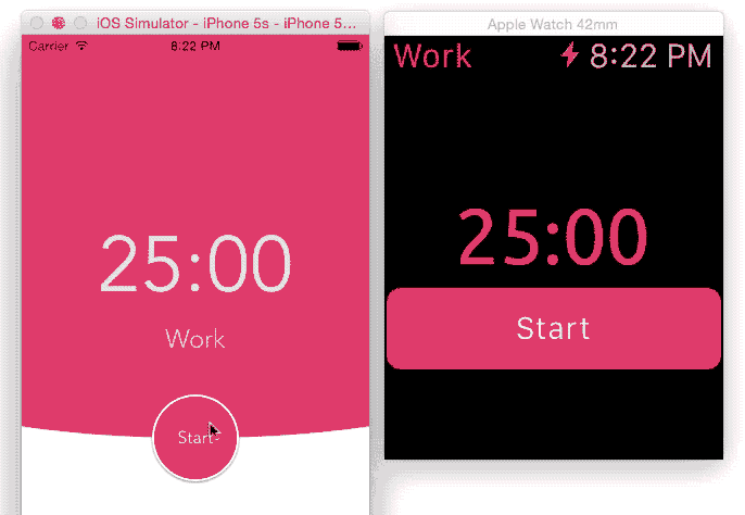
2 Way Event Binding Demo
From watch to phone
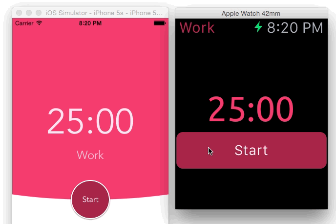
From phone to watch
App Lifecycle
With mobile development, it’s necessary to understand when a user will come into contact with your application. If the user comes across your application and starts using it when the visuals are incorrect, the user will lose confidence and not trust your application.
Working with Xcode and the watch simulator, my app has the following key lifecycle events:
- watch starts up
- watch resumes
- watch actions (button presses) are reflected on both the watch & phone
- phone actions (button presses) are reflected on both the phone & watch
Each of these events are essential for maintaining a consistent user experience that does not surprise the user.
Implementation
My implementation used MMWormhole for 2 way event binding. This means that the phone should know when a button was pressed on the watch and vice versa. Curtis Herbert has a great blog post on sharing data and events.
In order to have the phone app be responsible for the correct timer state, my phone app is responsible for returning a NSDictionary of the current timer properties. My watch app is able to get the NSDictionary and update the watch screen accordingly. It is important to note that my phone app is the ONLY source of the canonical current timer state. Trying to sync state between the phone and watch app would be a nightmare and a lot of work.
When the watch app starts, the watch app asks the phone for the current timer state (a NSDictionary) in order to set itself up correctly. When the watch app resumes from inactivity, it also asks the phone for the current timer state (a NSDictionary).
Using MMWormhole, I’m able to listen on events from the watch or the phone. When the user presses a button on the watch, the watch app passes a message to notify the phone, and the phone updates the timer state. Similarly, when the user presses a button on the phone, the phone app updates the timer state and notifies the watch app with the latest state.
Lessons Learned
- The phone app (not the watch app) is responsible for the correct state
- Use a Framework or shared classes (in File Inspector, add Target Membership) to DRY (don’t repeat yourself) out your codebase
Summary
With Pomodoro Pro, it was essential for a user to be able to start / pause / resume / stop the timer from either the phone app or the watch app. This required a way to manage the timer state (phone app) and have user actions occur on all screens (phone & watch).
In order to build a user friendly watch app, you should anticipate & identify where your app’s state and events come from. Make sure to account for those scenarios.
Pomodoro Pro v1.1.0 went live on 4/14/2015. Please let me know what you think @rexfeng


